plot_by_age
plot_by_age.Rdplot_by_age
plot_by_age(
  data,
  age_var = "age",
  y_var = NULL,
  age_label = "Age",
  y_label = NULL
)
Arguments
| data | data.frame |
|---|---|
| age_var | |
| y_var | |
| age_label | |
| y_label |
Value
plot with x-axis of age and y-axis of y_var
Examples
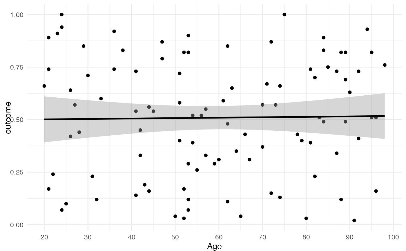
df_fake <- data.frame(age = sample(20:100, 100, TRUE), outcome = sample(1:100/100, 100, TRUE)) plot_by_age(df_fake, y_var = 'outcome')#>